Wholesale Pick-Up Available.
Closes at 5:00 p.m.
Wholesale Pick-Up Available.
Closes at 5:00 p.m.


The Prism is new hand-held pipe from BRNT Designs. Its design has subtle accents and features, with every aspect carefully crafted to optimize performance. This pipe walks the line of being a visual standout, while blending into the home.
Simon Grigenas, the CEO & Co-Founder of BRNT, said the initial inspiration for The Prism came doing research in light fixtures you would see in museums and art exhibitions.

“I was watching a documentary on interior design, and there was a ceiling light that caught my eye, it terms of shape, and how it housed the light bulb,” said Grigenas. “It was deconstructed, had a steel wire frame, and had geometric shapes made out of steel bars. We wanted to create a shape that is complimentary to the hexagon, but still has a sleek, geometric aesthetic. Something that doesn’t look like a pipe at first glance.”
After Grigenas had the initial inspiration, he reached out to co-Founder/Production Designer, Andrew Feltham for a hand with getting his design off the screen and into a tangible item. The duo went through multiple mockups before settling on the final product.
“There were a few iterations, mostly on the bottom.” said Feltham. “The bottom has an elongated hex, but played around with a pentagon and a couple more geometrical shapes before we finally decided on one.”
When asked about the final product, Feltham said it’s fairly similar to the initial sketch. “We really wanted to make a multi faceted pipe that you could stand on multiple surfaces.”

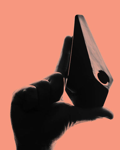
In mid-June 2019, in collaboration with Toronto-based photographer Tobias Wang, BRNT Designs began unveiling the finished product on various social media platforms. To the naked eye they may appear to be simple silhouettes of the pipe, but like everything BRNT does, there is a story behind the concept. The launch of the Prism happens to coincide with Pride Month across the globe, and inclusion is something at the forefront of the campaign.

Wang had been experimenting with silhouette photos with friends for a few months. Starting with simple photos of him and some friends having coffee. Next came silhouettes of hands. When he was approached with an opportunity to help launch the Prism, Wang knew exactly where he wanted to take it.
“The original idea was to use the pipe in a silhouette format. I thought it’d be great to spell out ‘LGBTQ’ in sign language, while balancing the pipe on the hands.” said Wang. The first image posted shows two Prisms side-by-side, in the shape of a heart. “It’s really about encouraging positivity and inclusivity.”
From the beginning, Grigenas thought it was a perfect match. He added the campaign is able to not only stand out, but really resonate with a broad demographic.

“At the end of the day, it might look very simple, and it might perform the same function, but we always ensure that there is a layer or a story behind how the design or the concept was thought of initially. All the way down to angles and how it feels in your hand. What we sought out to do with the accessory side of things was about destigmatization and breaking the mold behind what a traditional cannabis accessory was seen as.”
The Prism is available here.